Sunday 21 April 2013

Arrival of my Final Exhibition Standard Prints


Arrival of my Prints
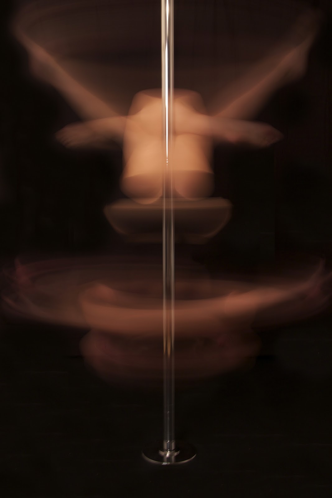
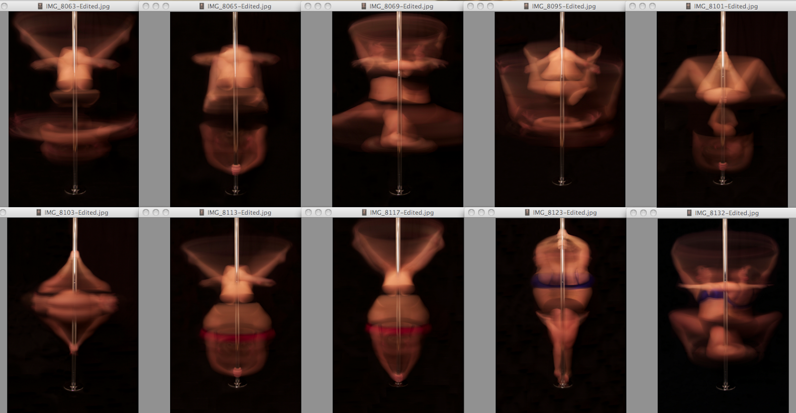
My final 10 Exhibition Standard Prints came through today and I am so pleased with them.  They have turned out so much better than I thought.  I was really worried about the colour of the body movements and thought they came across quite orangey but they actually look perfect.  Above shows the order in which they will be presented, as I want to split the colour up a little throughout the series.  For my Professional Practice I have used my Portfolio Box and therefore am not able to use it for this project.  I have chose to use a Red Box for my prints to sit as this would make them stand out and make the project unique in a way.  The main colour used within my images is the colour Black, so I would like to change that in my presentation.  Below I have placed two images of the Red box for my prints next to my Portfolio box.  Overall I am so happy about how this Major Project has turned out and think that the prints have done my work justice.  They look really professional.  The next thing to think about would be sizes for the Exhibition, I will fully decide a little later but in my mind so far, I envisage two of the images from the series blow up to size A2, so the really stand out, probably one of the coloured red images and the other black.  I would most certainly have black frames, so one should think I would use a black portfolio box, I like to think that it would stand out, make people ask whats inside 'the red one'. 
Finally, this series fits in perfectly with me as a Brand and works perfectly with my style of work.  Considering titles took some time, but 'Pole Motion' keeps it simple yet intriguing.  I think they are almost like beautiful moments captured in a unique way between the still and real time, a space in which we cannot see or belong, but a place, that does exist.  


Saturday 20 April 2013

"Pole Motion" Final - 10


To the few people I have shown the whole series too, which is mainly my family members, they have each said that this is their favourite image out of the whole series.  I can understand why, the move looks so elegant on the pole and theres quite a lot going on.  Her legs are in a strange but beautiful position with pointed toes and her arms are straight out.  But I think the reason why people react to this image is because of the way her arms are extend out above her head in a slightly bent position at the top which make a ever so faint light circle with her hands.  This is the second image with the blue colour top on, and even though it is not as noticeable as the other blue and the two reds, you can still tell that it is not the black top.  I had a comment on this image too which was the fact they liked that the face could be seen slightly too, as well as the shapes and motions.  I think its a nice touch to see part of the face but I did not want the face to be seen too much in the series and it is about the beauty in the motions and and human body form that I have been concentrating on.  

Friday 19 April 2013

"Pole Motion" Final - 9


This particular image in the series is probably the smallest move on the pole and the move compact and neat.  And that's the main reasons I really like this image.  It is different to the others because it's a move that hasn't got any limbs of movements coming outside the move itself.  I like the way that it forms a diamond shape on the pole.  What I find fascinating with layering images on images, just in a different way, the images has drawn itself on top by exposure, is that if you look at where her feet would be, its actually where her face is as well and it actually gives quite a mysterious feel as if you cant see any part of her, you just the the body and the body shapes and forms.  I would have preferred this image if perhaps the move was slower so that the move itself was a tiny bit sharper.  I quite like the amount of blackness around this images as it really makes it pop out and stand out more, even though it is probably one of the more blurred images out of the set. 

"Pole Motion" Final - 8


This is personally one of my favourites in this Motion series.  I particularly like it because of its poise, elegance, use of colour and the tidiness of the move.  The hands in the image have not moved for the whole exposure and give the swirly spin effect and the legs have masked each other both sides and look very symmetrical.  I like the red line that draws attention to the hands and the body position.  An I also like the fact that the move used the whole of the frame and is dead centre. I can see this image being very effective being blown up big as it is one of the most symmetrical out of the series.  The lines of motion are visible and the beauty of the body movements and position makes it make the exercise seem very elegant. The model is quite low on the pole, and quite close to the bottom but I wouldn't want her to be too much higher because I wouldn't want to risk having the feet too close to the top on a shot like this. 

"Pole Motion" Final - 7


This is one of the other images within this series that I have had comments like "oh that's strange", because the shapes are something that you don't really expect.  For this image you can see how the model is positioned on the pole quite well.  The spinning hands effect is at the bottom and looks like the  sharpest point of this entire image.  I like how there are three triangles visible in the image created by my model's legs in that certain position/move.  Again the black top stops us as a viewer seeing the models body and creates the effect as if we can see through them.  Obviously the light source I am using is high on its stand and out the way and was good for the normal lighting but I do think the underside of her body seems quite dark as if its not getting enough light from the main light source, maybe I should have made this image a couple of second longer or opened the aperture a bit more, because you can't see the bottom half much apart from the nice hand effect.   

"Pole Motion" Final - 6


This is the first of the Red's to show up in the series so far, and has quite a distinct red line in the middle .  I really like this effect as it draws your attention to the way her body is on the pole.  What I like most about the shapes in this image is that when you look quickly at the shot, you sometimes think or think at first glimpse that the legs are bent in a strange way that doesn't seem right, but then once you've looked at it again, you realise that the way she is bending in a curve on the pole is how the legs are in a curve like that, only at that point it makes sense.  One viewer who I asked an opinion from said to me It would have looked better if the bottoms of the clothing were red too, this quite annoyed me only because my model actually had the matching bottoms with her at the photoshoot, but we just got too into trying all these different moves that they were not worn.  But I do think if the colour blue images have black bottoms then these red colour images should have the black bottoms too, too keep the the same.  

"Pole Motion" Final - 5


When I was receiving feedback from friends and family about what they thought about the images and the project, quite a few of them mentioned this image quite a lot and said how very strange it is.  Some couldn't work out how she was on the pole for one.  And this is the kind of response I want from the images, I know that to someone who has not seen thing like it before, would question as to either, how its done of how is she on the pole.  What I also like about this image is how you actually don't really see my models face at all, this helps out in the wondering how she is on the pole. The black vest top again, covers her body from being seen therefore creates a space that could be considered lost or transparent.  What I like most about the image is the shape's of her form, it's so different to what were were expecting to see.  I like the straight arms at the sides of the frame because it makes the shape into a bowl.  Her legs are all crossed over each other and should make the viewer think.  The fact that the whole move used the whole frame space is good for viewing purposes.

"Pole Motion" Final - 4


This image is lovely for showing a big circle with her hands near the top of the frame, straight away I think this shot would have been better if she was a tad bit lower on the pole, it would have meant that the whole of the circle drawn in the air with her arms wouldn't be so close to the top.  I almost did not include this image because of the hand motion nearly being cut off but I still think it is effective.  I like how she is leaning her head backwards and pointing her toes.  If she was to be going slower around the pole and I had a shorter amount of seconds then I may have been able to capture a thicker line circle with her hands.  I do think that the pose itself is great and really works for my ideas and creates strange shapes in a ghostly mid air pose.  Capturing the beauty of both the human body's form and the motion it what I was aiming for and I think I have managed to to both of them relatively well. 

"Pole Motion" Final - 3


I have switched the order of my final 10 around so that there is some difference in the colours.  This is the first of the Blues to be seen.  This images is very tidy and neat.  Again almost symmetrical and had a great position on the pole.  I really liked having a move wear my model was able to face outwards away from the pole, especially in the colours clothing because it really makes it stand out even more.  Because of the blue top, you get a blue line across the image that breaks up the black and draws attention to the spinning.  This image has the same effect as before with her hands.  They've stayed in the same place and you can picture the spinning around and around in your head. What else I like about this image in particular is that it looks as if she is pointing her toes right at the bottom of the pole base, it looks as if she is standing on point and jus leaning against the pole when she is actually on the pole and not touching the floor. 

"Pole Motion" Final - 2


This image strikes me as a very neat and tidy motion.  The motion are not exactly symmetrical due to how the move is on the pole but they do stay in quite neat.  The part I like the most in this image is the hands.  The hands are stayed in the same place for the whole duration of the 3.2"'s and have made a swirly band wrapped around the pole.  It is the clearest part of the image and the smoothest as the same thing has been repeated again and again.  I also like the black vest leaving a space in the middle thats almost completely transparent.  I chose this particular move over another image of the same move because this one seemed to be spread through the frame more and sets more centralised.  You can see one of her feet quite well and the point of her foot looks nice, if anything, it says elegance.  I also notice her hair in a bun quite a bit in this image, not a bad thing, it shows that the exposure time is slow fast enough to see the bun. 

"Pole Motion" Final - 1


I really like the positioning of her body in this image.  It looks elegant, the way her legs are pointed out and nice and high and her arms go round to form a dish shape.  I look for shapes a lot in motion photography and try to pick out what looks good and eye catching.  I like that because she is wearing a black vest top, her middle section looks almost invisible, I think its what I like best about this particular image of the series.  Because you can tell that she is upside down on the pole you know she must be holding onto the pole with her legs, but it almost seems as if she is jus floating there. 
What I also really like about this, is the fact that you can still see the pole quite clearly through the middle.  I honestly thought that the movements around the pole would make quite think lines across the from of the pole, but due to it being my focus point, it sees through the movements.  It gives a ghostly elegance to the move and creates a difference to the norm of dance.  Pole dancing can be very beautiful too.  One more thing to add is how symmetrical this type of effect it, so what I look for in my images is a symmetrical image that sits will on the pole and show a beautiful motion with the body. 

Wednesday 17 April 2013

the print space - My Prints

Now that I have finally been through my long process of editing my Images down to a Final 10, I am now ready to send of to get them printed. 

The brief for this module, and as i have mentioned many times, says that I need to have 'normally' "10-20 Exhibition Standard Prints".  And as far as I'm aware, the print space, are probably to top top around this area.  I have sent images to theprintspace before and have actually visited the building gallery and printing shop before back when I was in College.  They have a very high standard for their prints and they take a lot of pride and pleasure with the prints that get sent to them.  

Money is quite difficult for this module this year but what else could I expect for my Final Exhibition Year at University !!  I knew that we would have to be spending big for our prints and work to look the best it could be.  Because I know that I want my images to be the best they can be I definitely chose theprintspace to print my finals.  Here I have included some print screens off my order. 

The image above shows all of my 10 prints edited and ready to be sent off to theprintspace. I have chosen to print all of my 10 images at A4 size because this is a standard size to submit with.  One all of my images were sized correctly I could upload them to the size I wanted.  The image below shows an print screen of what paper I chose for my prints.  I went for C-Type 'Matt' Paper.  I chose Matt paper instead of Glossy because my images have a lot of black on, the majority of the image is black, I didn't want the print to be too reflective.  Hopefully with the Matt Paper Type they shouldn't be shiny but the blacks in my images will still be a deep black.   

I have not yet received my prints back in the post but when I do I shall upload a new post of what they have turned out like.  I think that I have really enjoyed working with the body and motion long exposures, and thats why I really am hoping they look as good as a print because I think they look great on screen.  Just have  to wait and see. 

Sunday 14 April 2013

My FINaL 10 Images

After all the hard work and Editing Process of narrowing my images down from 105 to just 10, I have finally done it and I am happy.  When I originally started this project and moved onto my Dance idea, I would have never of thought these would have been my outcome but I think I chose a topic that suits me and my style of work and I have enjoyed it.

Here are the exact edited Final 10 images of my "Pole Motion" Series and Portfolio for this Module.  I have displayed them like this together because I think that they work well next to each other so you can see the true beauty of the motions around the pole. They compliment each other and its nice to see how different one move can make. 

Evaluation on my Whole Project Series
The way I started this module was from looking back on a very successful series I produced of the Nude's in my first year, which I produced on location.  I think because these were successful I wanted to improve on them and extend, I looked into the body in depth, and how the human 'form' can create so many different shapes.  Dance started by thinking of a way the create beautiful movements with the body and of course dance shows the true beauty of the human form through different expressions, shapes and movement, and is exactly why I followed that route.  Motions within dance and the body can really produce creative work, dating back in history right through, nude phases and up until the now. This is something I have always been interested in but never got round to following it up, so for this project I wanted motion and movements to be my main focus and soon enough, connecting dance and motions together brings my long exposures.  Im surprised really that I hadn't thought of long exposures from the beginning of this module.  If I had, I would have many different shoots, with different colours and ideas.  Researching into long exposures always fascinates me, but it was Bill Wadman's work that struck me straight away and stayed with me for the entire project. 
I was fascinated at how his motions of the dancers have so much flow and smoothness, so I followed this up and produced my own ideas and created a twist to the norm dance and have Pole dance.  I love how long exposures can really show so much as well as not showing much.  I've captured the moves and motion going round the pole again and again and every time the moves fascinate me as the possibilities keep going.  I would like to think that I have created some different and unique motions around a Pole, and that the shapes, look truly beautiful.  I personally think they are interesting to look at as you start to see the move go round inside your head whilst looking at them. The motions could have been faster for each one because then the blur would be thicker and the they would all appear a lot smoother than they are.  But with re shoots for this in my spare time I will create even more and maybe try and find new shapes and motions.  As a whole series I think they work great together, they compliment each other and they are all spinning elegance. 

I have included each individual image here too;
Each image will be Critically Evaluated by myself Individually. 


Friday 12 April 2013

Rejected Photos ( II ) : from 14 - 10

In the previous Editing Down Process 3 Post, I showed phone pictures of when I hand rejected 4 images from the series of 14 images to 10.  The reason for cutting the four images was because of the printing purposes.  The exhibition standard prints that I am getting will cost quite a bit so, I wanted to make my series of images 10 instead of 14 so its a little bit cheaper.

I had already edited and finalised the 14 photos so that they were exactly how I wanted them and then I had the hard job then of trying to decide what four images I would take out of a set of 14 images that I really like, its always annoying taking out an image that you like from a project.  But I have managed to do it and here on this post are the Four Last Rejection Photos.

The first image (top left) has been rejected because when I looked at this image compared to the rest of the images, it looked as if it was in sharper focus.  Although all the images are blurred in the long exposure, this image looks sharper and stands out, the reason for it being sharper is possibly the speed in which my model was going round the pole, it is a tight in move which makes her still for longer.  Its a shame, because I really like this image, especially to show The Body & Motion.

The second image (top right) has been rejected for similar reason to the first, although for this image I decided that my model was too low to the bottom of the pole.  The red line of the bra colour looks great and I like the move and position and the motion but if she was a bit higher it would have looked better.  I also have another image in the final 10 that is the same move higher up on the pole but in black instead of colour.  I think these two top images next to each other look great so its a shame they are not in the series.  
first   >   REJECTED WORK   <   second
The third image (bottom left) has been rejected because the model is too high on the pole.  This could partly be down to me as photographer but due to the angle and size of studio, I could not go any higher, therefore i would have needed this move to be lower on the pole to get the full circle of her feet in frame.  I had already cut our the other move that was similar to this before, so now, this move is not included within the series, I like the move, but the full circle would have looked good.

The fourth and final rejected image (bottom right) has been rejected because it was voted as the odd one.  There are better moves within the final 10, and this one isn't really noticeable that it's not in the series.  I do like the move and the position is quite funky, but I need to make sure I had 10 finals, so one more definitely had to go and I was happier with the other choices.
third   >   REJECTED WORK   <   fourth
When I look at these four Edited Images, I still feel as if I really like them even though they are rejected from the series now.  At least I now have 2 reds, 2 blues and 6 blacks within the series.

Wednesday 10 April 2013

Editing Down Process ( III ) : 14 - 10 Finals

All of these Images on this Post are Mobile Phone images of myself hand rejecting small cheap Prints from Boots to help with the editing down process.

So I went to Boots to get some small prints printed to actually check if the editing on the images looked like it had been done correctly. Because I was working with a plain black background, I was unsure if the editing over the black could be seen or not, I was also a bit worried that you could see editing marks on the background - so wanted to print some to see if it was plain black ... and it was.

The Reason I'm cutting down from 14 to 10
Even though our brief for this module says that we should have 10 - 20 exhibition standard prints, doesn't mean that I have to stick to a certain number of images that is mentioned.  Cutting down from 25 images was a good idea and the 14 seems ok but the real reason is thinking about printing purposes. I know that I am happy with the final 14 and would quite happily keep the set as 14 but, One, I said on the post before that I have four reds and only two blues and want to make it equal and cut out two reds, and Two, because the "exhibition standard" prints that I want to get can work out quite expensive, so to make it that little bit cheaper for me, I have decided that I only want 10 final images.

I laid out all of the small prints on the floor so that I could see them from a distance.  Just to note - these prints here are NOT the finals, they are cheap small prints for selection process only. 
I have made a timeline of how I ended up rejecting the 4 images.  The top image is of the 14 finals I had on the post before, and I made small Red Crosses to make it easier to see what I am rejecting.
The 14 Images to Begin with
Red Cross to mark Rejected Photo
These two phone pics above and below show myself putting the crosses on the images that i am rejecting.  I had help from my family who were also giving critique on what ones should be eliminated and which ones should stay.  I only have to rid of 4 images but it's a lot harder when they are all images I like and would like to keep.
Editing Down Process
Red Crosses mark Rejected Photos
The two phone images above and below this piece of text show what images I have rejected.  I have then moved the four rejected images to one end and left a gap on the floor between the final 10 and the the rejected 4.  Having the images in hand is a great way of cutting out, eliminating and rejecting images for any project.  It is always nice to lay them all out and step right back so you can see which ones do not look right.
Before & After - 14 Images - 10 Images
The Final Chosen 10
So this last image shows the final 10 that i have chosen for this module and these 10 around in my final series.  I think that I have chosen well and the rejection and selection process has been a success. 

Monday 8 April 2013

Editing Down Process ( II ) : 14 / 12 Finals

All of these Images Here have been Edited and finalised as a set of 14 for now. 

Now that I have taken away and rejected the painting with LED lights images, it now looks more like a photographic 'set' of images.  I actually would be perfectly happy to leave it at these final 14.
I think that they fit well together and show a range of moves that look creative and unique.

So at this point in my editing down process I have:
8 images with my model wearing Black,
4 images with my model wearing Red, and
2 images with my model wearing Blue.


Like I mentioned before, these 14 as finals would be fine in my eyes.  I like all of them and think they each hold something different.  There are not two images that are too similar to one another and there shows a long exposure of a pole dancer,  in a unique and slightly different way.

The only thing I would consider doing from this point onwards is deciding whether I should take out two of the 'Red' images and to make it a final 12.  12 Images would be even easier to handle and work with and it would only be cutting two.  I think this should be something that should happen because then the two Blue coloured images wouldn't seem as odd, if there were two blue and two reds and the rest black it may fit in easier.

Rejecting two Reds
I think that the project would work better if there were just two reds and two blues, but at the moment, with 14 images I have 4 reds and two blues.  The two images that I would cut out and rejecte if I had to rid of two reds would be the bottom two reds in the above image.  I would do this because the image with the legs in the air, there are a few other with legs high in the air.  And the other bottom red image would be because I kind of stands out as being odd, even though I like it, It stands out too much. This is something that will happen in the next editing down process.

Saturday 6 April 2013

Rejected Photos ( I ) : from 25 - 14

This post is to show my rejected work so far and why it had been rejected from the rest of the series.  I said in the first editing down process that 25 images is too many to have for the set brief for this module and it would be harder to handle for printing purposes. Cutting down would have had to be done. Too see the difference in what photos I have cut out you can look back at the post before this one which shows the first 25 picked images.  The photos here are the 11 rejected photos to make the 14 finals.

The first image to be rejected (top left) was taken out purely because compared to the other positions and moves that me and my model came up with, this one looks too simple.  What I like about this photo was the fact she wore a black vest top, it almost seemed as if the section in the middle was invisible, but still not as creative as some of the other moves.  The second rejected image (top right) was rejected because it stood out as off compared to the rest in the series, most of the others use motion in more of the frame and this one doesn't as much, it is also cut out because her face is a bit too far to the edge of frame and may be cut off slightly.
first >    REJECTED WORK    < second
The third image to be rejected (below left) is one I called the teardrop shape, and still quite like as an image on its own, but again it was rejected because it was a bit too simple and obvious compared to some other which use more creative moves and motions. The fourth image to be rejected (below right) has been rejected because there was another image chosen which was exactly the same move but the arms on the outside edges were extended and straight whereas here they are bent, I thought the straight arm one was better so rejected this one.
third >    REJECTED WORK    < fourth 
The fifth rejected image (below left) was rejected because I had too many other better moves that had the legs extended high to the top of the frame, and also because I have used another image which is the same move but without the legs down the bottom.  The sixth rejected image (below right) is actually one that I really like, but there was another image exactly the same move but the legs were higher, meaning the move was in more of the whole frame, which I agreed is better for viewing purposes.
fifth >    REJECTED WORK    < sixth
The seventh, eighth, ninth, tenth and eleventh images to be rejected were all of the 5 LED lights images that I really wanted to include at first.  The reason for rejected to include these images into the body of work is because they are different to the ideas that I had and the other images from the shoot shows more body movements, motion, dance and shapes, which are all things that painting with light could have shown too.  But another reason to reject this work is because I really wish I had turned my light source softbox back on the this part of the shoot.  It would have looked better with the LED lights if you could see the dancer better.  If I had changed the lighting and I could see the dancers moves, it would then show what I wanted to show.  But the lights was a test anyway to see if it would work next to my main ideas of the motion long exposures which I have done more of.
REJECTED WORK

Friday 5 April 2013

Editing Down Process ( I ) : 25 Finals

So from the Photo shoot I have around 105 Images to choose from, and as I said before I am happy with how the shoot went and think the result looks great, it fits in perfectly with my motion ideas and working with the body and shapes. 105 is quite a lot of images to narrow down, but from the contact sheets I chose my favourite ones and then picked out the best from the whole shoot.

The first editing process I worked on around the brief which says that I need to have '10-20 exhibition standard prints', so I thought Id aim for 20 as my first selection process.  This I managed to do quite easily with the help of my family who helped me to be quite critical about some of the moves and individual images.  I had the whole shoot up as a slideshow on my computer and chose the most striking positions on the pole and the moves that created the best looking movements.

Here below are the final '20' Body Movement Images from the whole shoot of 105 images.  The reason I have 25 images here is because I also chose the best images from the Light painting shoot and decided that I wanted to print these images too and involve them as part of the series.


I have used 13 images of the model wearing Black,
I have used 5 images of the model wearing Red, and
I have used only 2 images of the model wearing Blue. 
I have also used 5 images of the model wearing the lights. 

I like that I had used some of the colour images as part of me thinks they stand out more than the black ones.  But another part of me think that the black clothing images concentrate on the body more and shows an exaggeration of the motions because you don't get distracted by the colours.  As far as the painting with light LED, images go, I just think they would look fantastic blown up big and would be quite striking looking at how the circles were made, this is the main reason as to why I really wanted to include them.  If I choose not to include them I would love to re-shoot just LED images and have it as a separate series for Portfolio basis.  I am happy with this set of 25 Images but have a feeling I will need to cut them down.  25 is too much to deal with and I have to think about printing purposes as well.  

Thursday 4 April 2013

The Shoot - LED's on Claire

I just thought I'd include a small post about how I actually attached the LED's to my model.
This was something that I always wondered before when I saw things similar, but now I know how easy it is, it's given me so many ideas for new ways to make it even more creative.
On the post earlier on in this project I showed how the lights were made and connected to the battery, and showed test shots, but these actually show my model wearing them and how the images turned out and initially how they worked.

The light was already duct taped up and was on wires so it could be made into a bracelet kind of thing, but instead, I just used duct tape again, and literally taped the wired light to her fore arms and ankles and on top of her feet.  It looks quite funny when not through the exposure but in long exposures the light look fantastic. I have included the attached pictures and two of my favourite LED photos at the bottom from the photoshoot.


Tuesday 2 April 2013

The Photoshoot & Contact Sheets

The Photoshoot
I personally think that the photoshoot went fantastically, and had better results than I thought.  I think the main reason for this is that there was no way of me seeing even an example of what I wanted to do in my tests because I needed someone that could actually do pole fitness.  Claire was an amazing model as is she an amazing Pole fitness instructor and dancer.  She helped me with all ideas and got really into the shoot, kept thinking of new things to try to create all kinds of shapes and motions. The nicest thing for me is that she had never seen anything like long exposure dance photography before, so it made her more excited and interested. We worked through a couple of hours of trying every move we could think of together and came out with lots of great results.  She had brought some different colour clothing with her and I shot sections of the shoot in the other colours.  The lighting was fine throughout the whole of the body movement shoot and I kept it the same so that they all looked the same, I didn't want to change too much from what I had at the test shoots.  I love looking at all of the images next too each other because some of them just look so different from one another, that the thing I found most interesting.  If I had longer on the shoot I could have maybe changed the lighting slightly to make just the motions a bit less orangey, but I am happy with the overall result.

The Contact Sheets
I have placed every Image taken on the shoot next to each other in contact sheets.  All images on the post are UN-Edited, and are straight from camera.  Looking at a whole shoot on contact sheets can be really important.  It is a great way to start the first selection processing of narrowing the images down to form the series.  When looking at contact sheets you can see images that stand out as being odd or wrong, in frame or touching the edge of frame, and this is a good way of eliminating images.  I can already see some favourite's of mine from these images, but will show on the eliminating process.


As you can see above, the last part of the photoshoot I did actually use the LED lights.  I really like that I was able to squeeze in some shots of the lights because they are really effective.  It's a shame that I actually changed the lighting for when using these lights because I didn't need to.  If I had kept the lighting the same as it was for the original shoot and jus added the LED light to my model then I would have been able to see the dancer as well as the light circles.  When looked at bigger the lines of light are very effective, the possibilities are endless.  I should have maybe started trying out the LED lights sooner so that I had more time to shoot with them as I may of tried changing the lights after a while.  The original ideas of the lights came from John Spence's work, so I should have kept the whole image the same lighting set up as before, so I could see the movement and lights, not just the lights.  I'm still happy with my motion long exposures though and will start the editing process next.